Illustrating Complexity
2021-2022 | MDes Coursework & Personal Projects
IIT Institute of Design / Personal
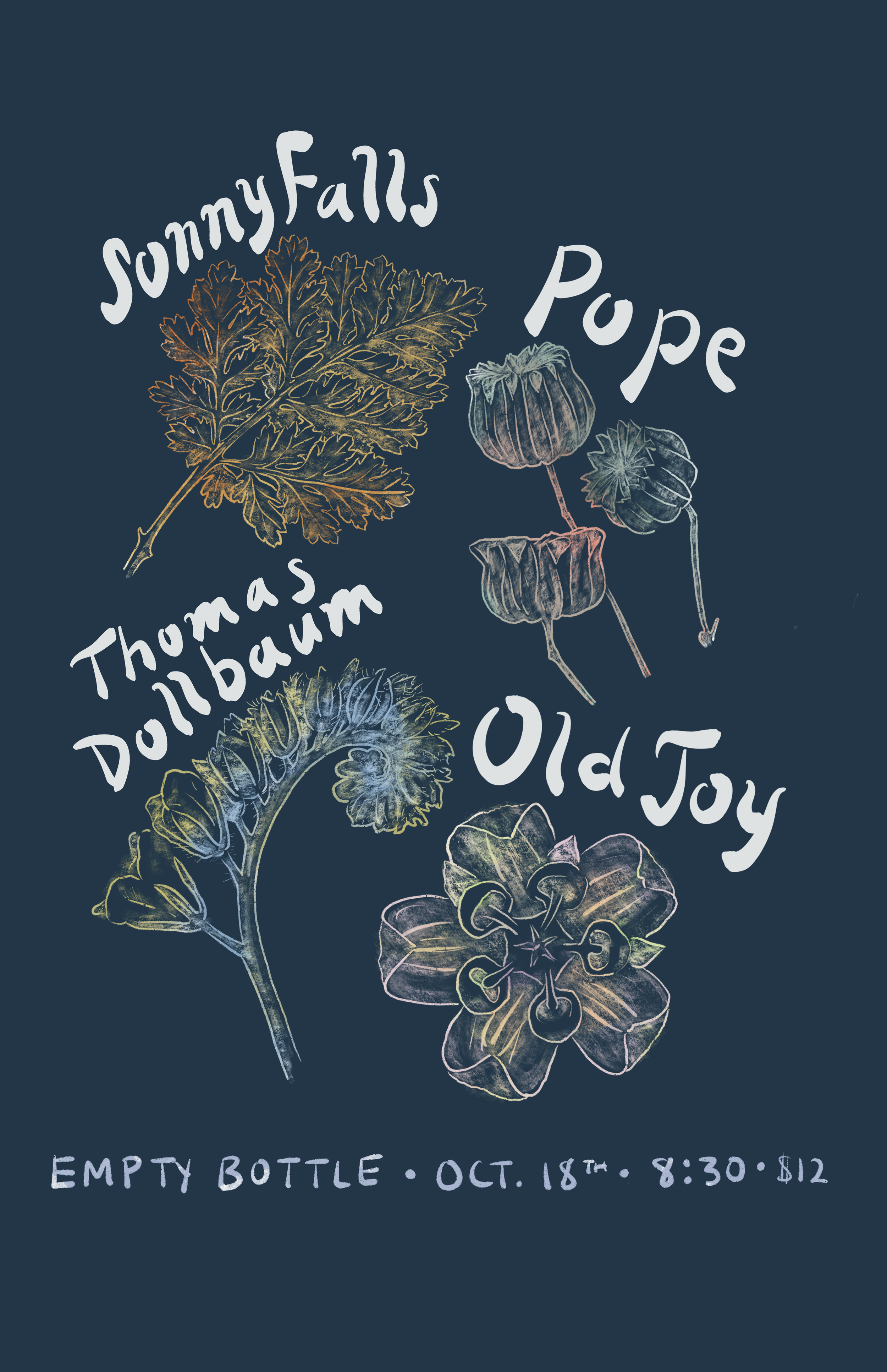
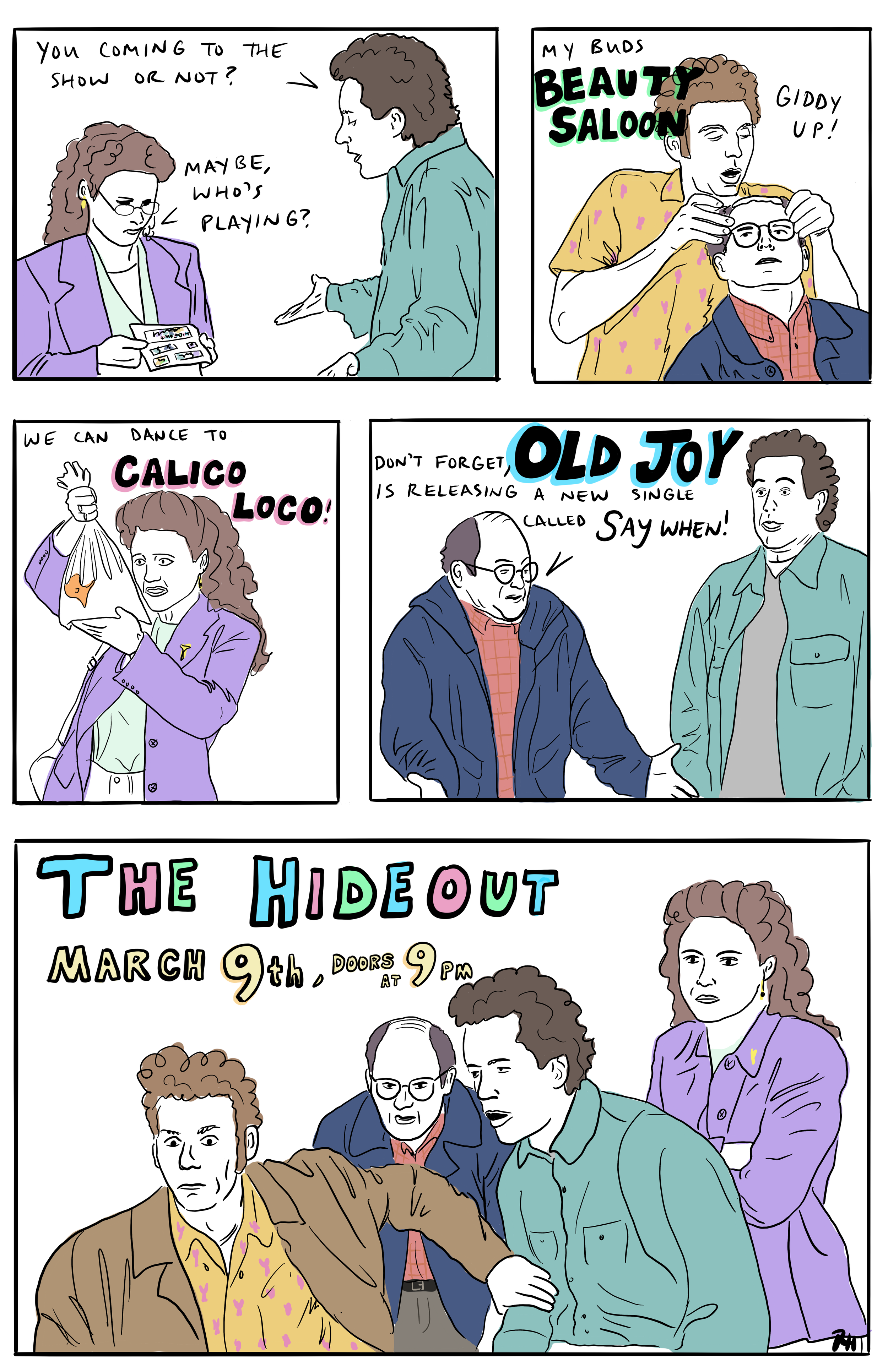
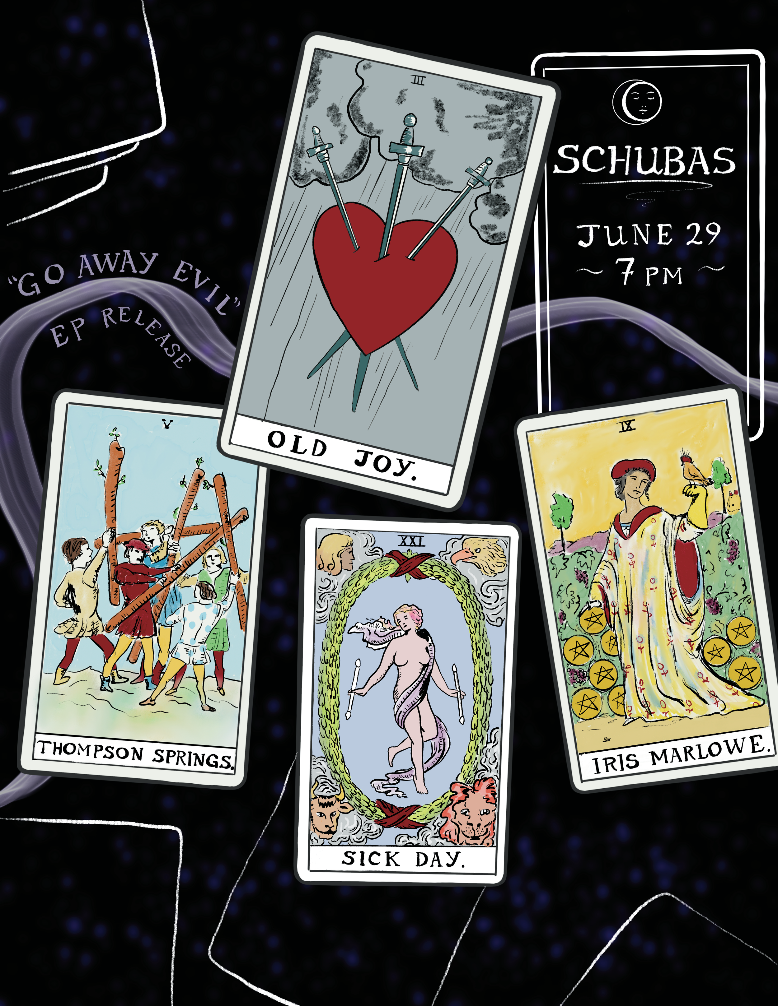
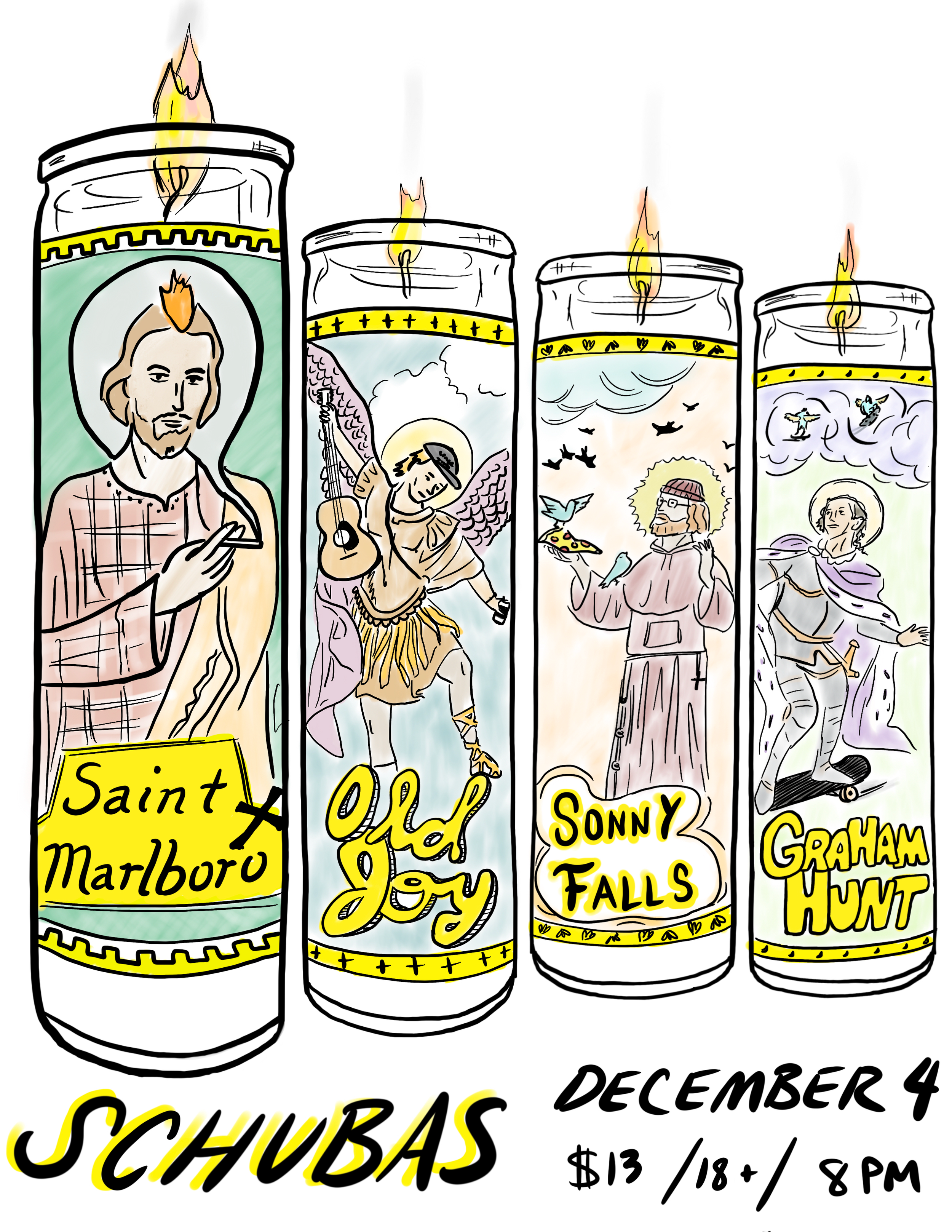
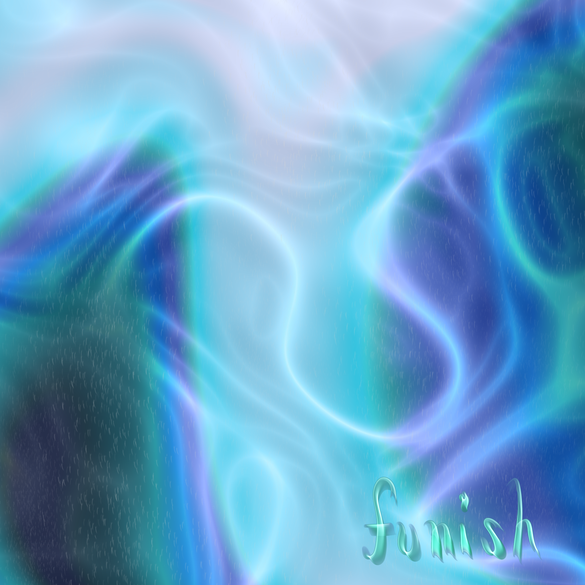
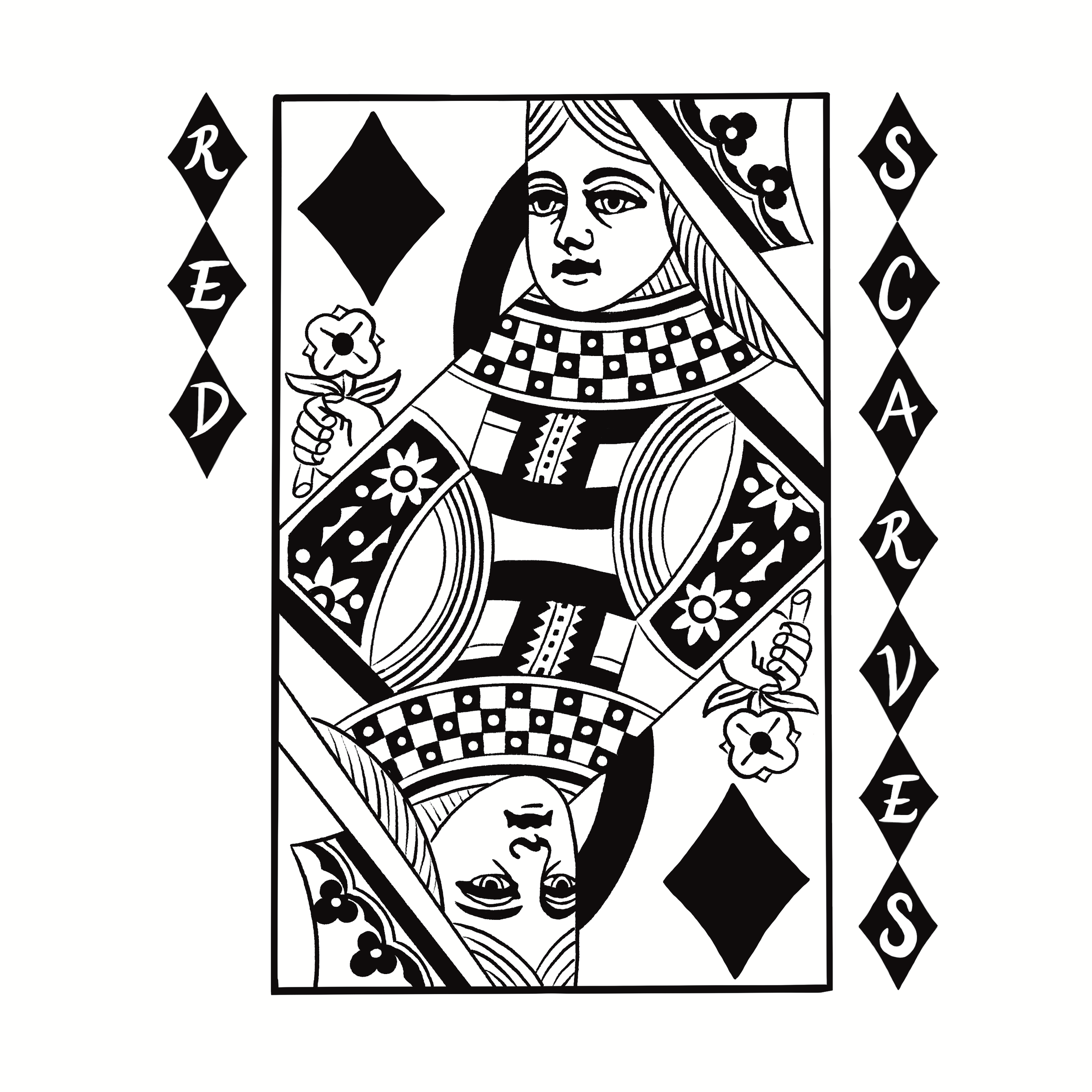
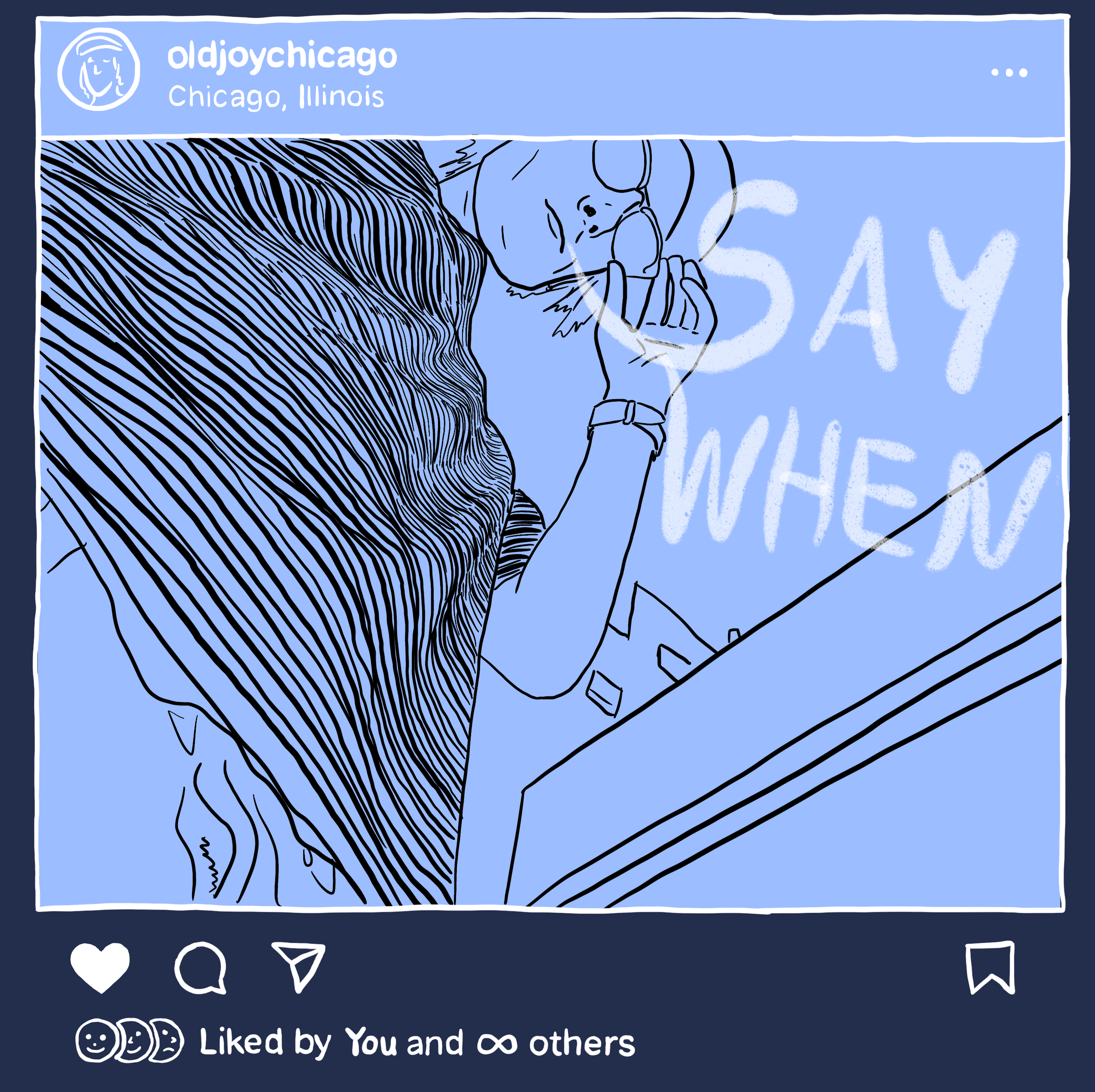
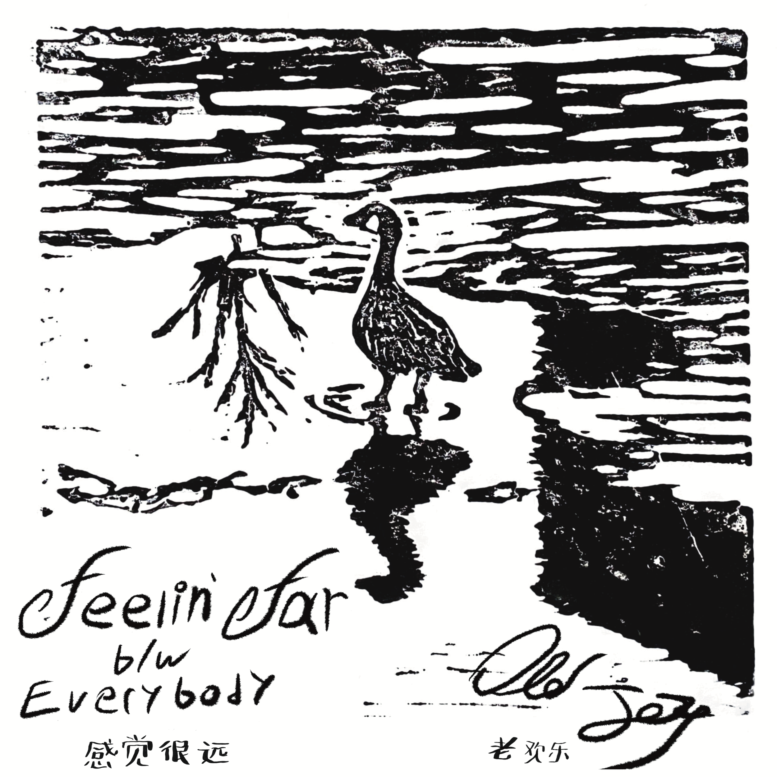
Communication design is a core component of the design curriculum. As such it manifests in various coursework through diagrams, posters, maps, and presentations. Additionally, I have designed flyers, posters, and media products as part of my personal involvement with music. This section is devoted to the visual design work as a collection.
Illuminating the Invisible
2022 | Strategic Communication
What might prospective students be interested to know regarding ID’s view of big data?Using the “Relativity/Conceivability” Technology Gap panel transcripts from the Design Intersections 2018 conference, I mapped the panel’s themes, trends, and points of view in order to create a poster and short presentation.
With an excel sheet I conducted thematic analysis, tallying quotes from each panelist with discussion topics, points of contention, and differing opinions. Using this reduced list, I made three different mappings of the content to determine the messaging of the poster.
Asia Pacific Weather Matrix
2021 | Visual Communication (ID)
Using a provided 3-day weather report for Asia Pacific cities, using InDesign I created a single page infographic that encompasses all information with custom weather icons designed in Illustrator.
Final Iteration: The color change was intended to create a strong contrast between the white text and weather icon palette.
Second Iteration: The map, drawn using an iPad, creates a more direct understanding of weather patterns geographically. The callouts create separate information zones creating a placement challenge.
First Iteration: The simple table is a practice in applying a grid and alignment rules based on information type. Aligning on the decimal, providing symbol legends, and creating visual hierarchy were key.
Driving Stick Shift
2021 | Visual Communication (ID)
Breaking a complicated process down to individual steps was the objective of this assignment. I chose driving stick shift as it’s my preferred way to drive and one I’ve become very accustomed to. I created the icons and wrote the content myself.
Final Iteration: The car’s color was altered to increase the contrast, drawing the eye closer to the center of the content. The top/banner content was balanced so the reader does not search further right on the page.
Third Iteration: The car icon was added to each step to clarify what stage of the process the reader is in, creating a redundant form of information if the text is not read. The icons were labeled above, creating a separate zone between initial information and process steps.
Second Iteration: The car shaped banner acts as both an information bar as well as an icon legend. The speedometer graphic was created to inform the driver which speeds correspond to which gears.
First Iteration: The diagram of the gear locations from the stick itself is duplicated to show what action the driver should perform. The overall layout, process stages, and icon designs were established.
Music Graphics
2021-2022 | Personal
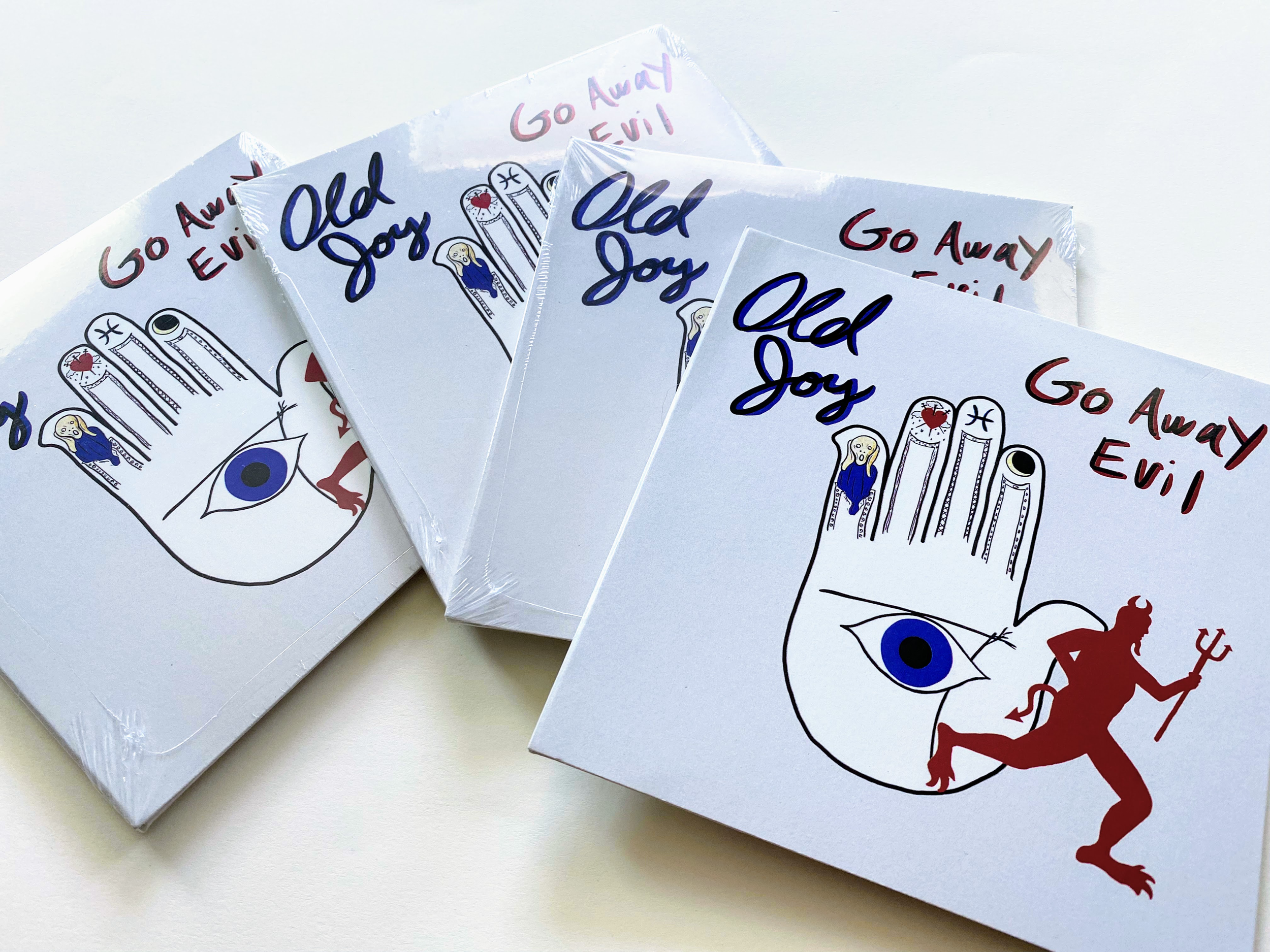
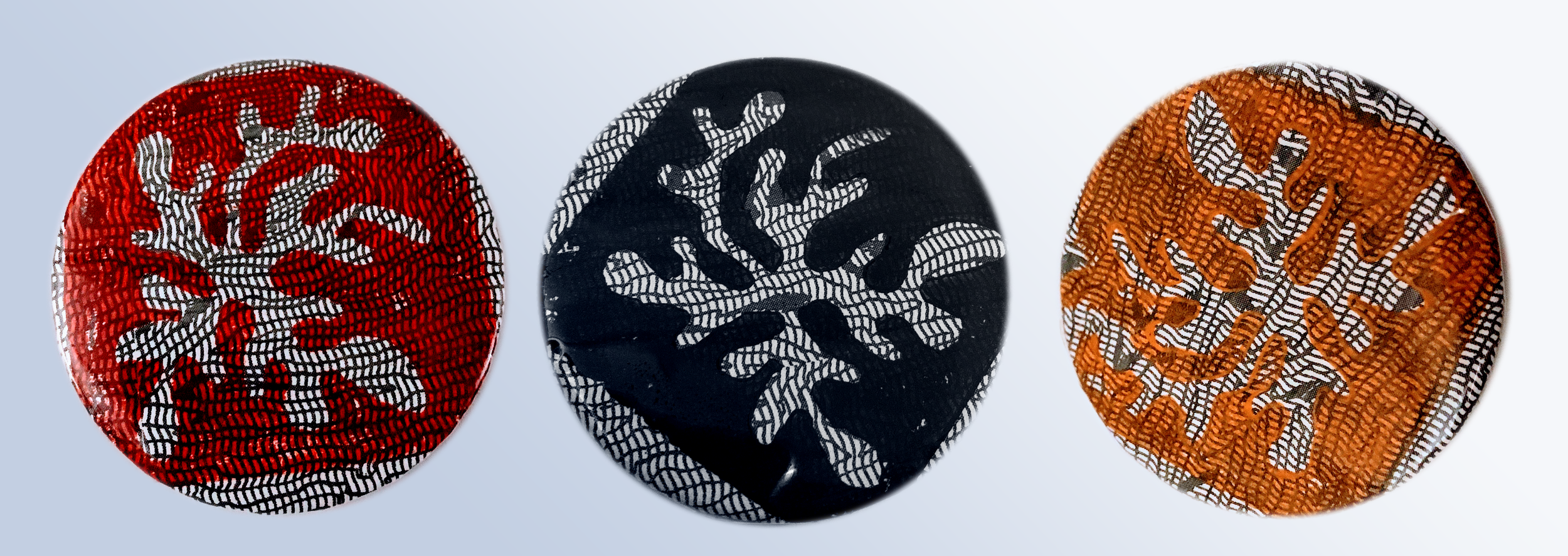
Ever since I was part of my college radio station in undergraduate I have been heavily interested and involved in local music scenes. With my friends and partner I created several flyer, poster, t-shirt, and album art designs shown below.
